
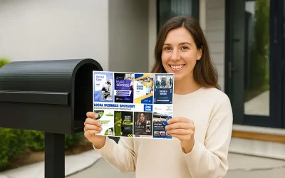
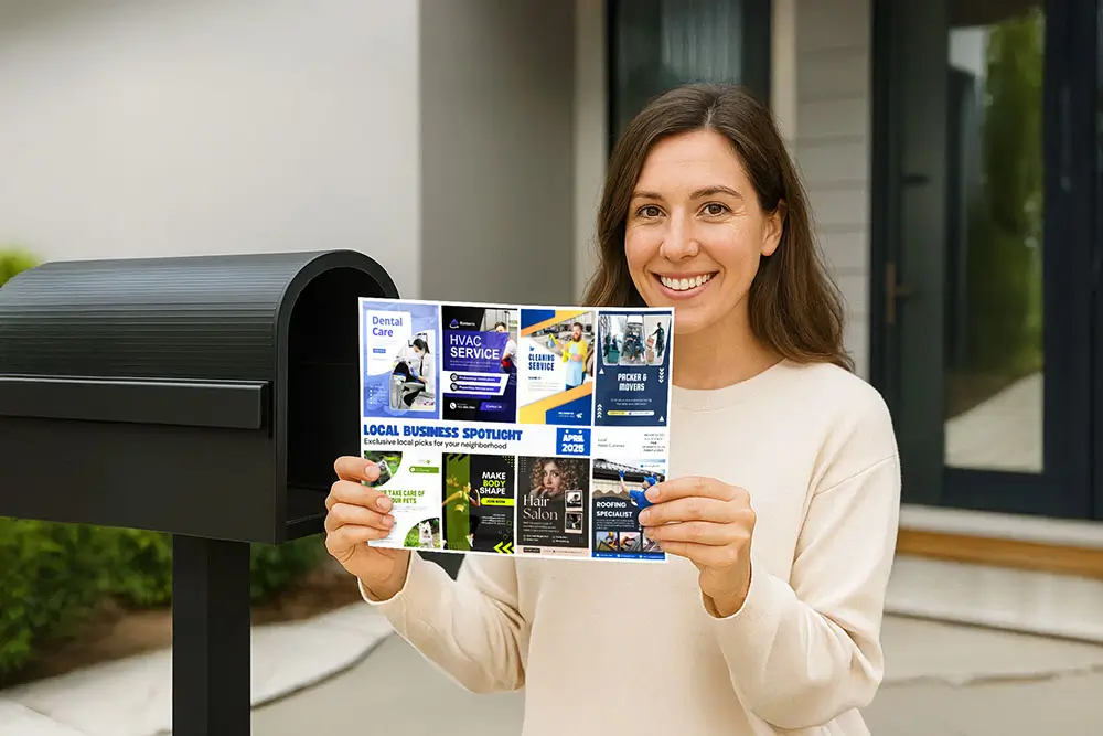
When you join a shared postcard mailing, your business is featured alongside other local businesses — which helps everyone save money while reaching thousands of homes. But with limited space, it’s important to use every inch of your ad wisely.
Here’s how to get the most from your postcard ad spot, no matter which size you choose.
1. Focus on One Clear Message
One of the biggest mistakes businesses make is trying to say too much. Your ad isn’t a brochure — it’s a visual hook. Keep it focused on one main message that answers:
👉 Why should someone call, visit, or buy from you?
Examples of focused messages:
- “$25 off first service”
- “Now delivering within 5 miles”
- “Voted best tacos in town — come try them!”
Avoid squeezing in too many offers or services. Simplicity = clarity.
2. Use a Strong, Bold Headline
Your headline should be the first thing people see — even at a glance. Make it bold, clear, and benefit-driven. Instead of saying:
❌ “Joe’s Lawn Care – Your local lawn expert”
Try:
✅ “Save 20% on Lawn Mowing – Limited Spots Left”
A good headline creates urgency, promises value, or triggers curiosity. Keep it short, sharp, and easy to read even from a distance.
3. Include a Real Offer (Not Just a Logo)
Logos build recognition, but offers drive action. A great offer doesn’t have to be a big discount — it can be a free consultation, a gift with purchase, or limited-time availability.
Make sure to:
- Mention any time limits (e.g. “Valid until July 30”)
- Include conditions (if needed) in small print
- Use the word “Free” carefully — only when you mean it
4. Add a Clear Call to Action (CTA)
Once someone sees your ad and likes the offer — what should they do next?
Always include a clear and specific call to action, such as:
- “Call Now to Book”
- “Visit Our Website to Order”
- “Show This Postcard for 10% Off”
Pair it with contact info that’s easy to read:
- Phone number
- Website or QR code
- Business address (if it helps)
Tip: Use click-to-call phone formatting like (555) 555-5555.
5. Show What You Do with a Visual
Photos catch attention faster than words — and they’re especially helpful if your business type isn’t obvious from the name.
Use:
- A real photo of your food, shop, or work
- A clean, high-resolution stock photo that reflects your service
- Icons or illustrations if done professionally
Avoid:
- Blurry images
- Clip art or too many overlapping visuals
- Generic photos that don’t reflect your brand
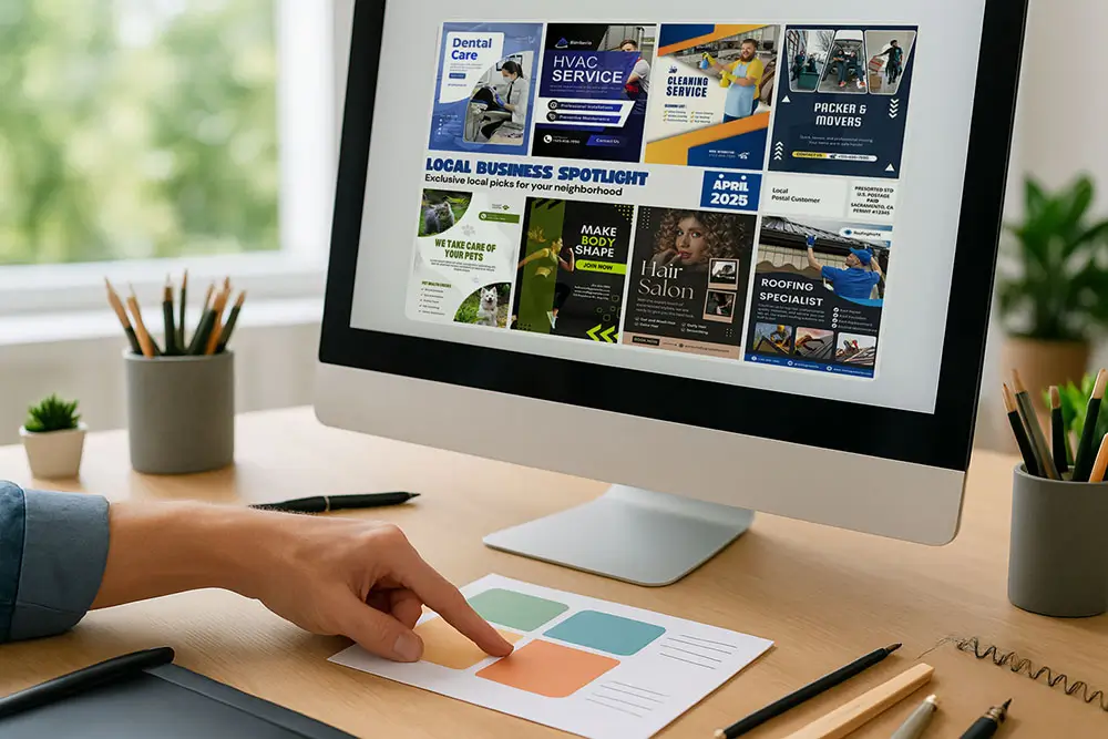
6. Keep Your Layout Clean
White space is not wasted space. Cramming too much into your ad makes it harder to read and easier to ignore.
Use a layout that includes:
- A headline at the top
- Visual in the middle
- CTA and contact info at the bottom
Make sure each section has breathing room. Use a simple color scheme that matches your brand but still pops on a printed postcard.
7. Stay Consistent with Your Branding
Even if the ad is small, it should still feel like “you.” Use:
- Your real logo
- Your business colors (as much as possible)
- A tone of voice that matches your brand
This helps people remember your business after they see the postcard — especially if they follow up online.
8. Proofread. Then Proofread Again.
Spelling errors or missing phone numbers can kill your results. Before submitting your ad:
- Check spelling, phone number, and website
- Ask a friend or employee to double-check
- Read it out loud to spot awkward phrasing
We’ll review everything before printing too, but it’s always better to catch errors early.
9. Know Your Ad Size and Placement
Each ad size has its own advantages:
- Regular size: Great for concise offers and branding
- Large: More space for visuals or longer CTAs
- Extra large: Ideal for premium businesses who want standout attention
You don’t need the biggest ad to get results — you just need to use your space well.
If you’re not sure which size is right for you, we’re happy to advise based on your goals.
10. Let Us Help if You’re Not a Designer
Don’t worry if graphic design isn’t your thing. That’s what we’re here for.
Most of our customers simply send us:
- Their logo
- A few details about their service
- A simple offer and contact info
We’ll create a professional, eye-catching ad that fits perfectly on the postcard and gets results — all included in your package.
Final Tip: Simplicity Sells
When it comes to shared postcards, less really is more. A clean, bold ad with a clear message will always outperform a cluttered one.
Think of your ad as a handshake — something that grabs attention, leaves an impression, and invites the customer to learn more.
Want help making your ad the strongest it can be? Contact us anytime — we’re happy to help you make the most of your spot.


0 Comments